


Because no one likes going into the dealership...
No one, and we mean no one, likes the typical car buying experience. The team at Netrocon Digital realizes this. That's why they've set out to build the first digital auto negotiation platform in the United States. The Hammock Creative team was brought in to help define the products brand identity and help the development team visualize their MVP. We provided UI design direction, user experience analysis, and prototyping... lots and lots of prototyping.
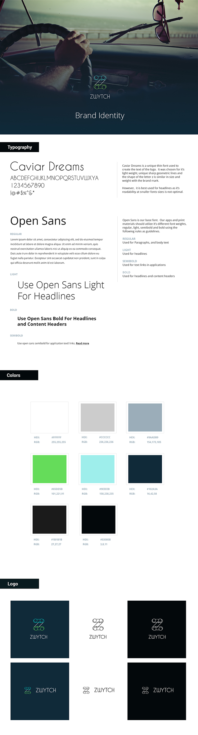
The Brand Identity
What's in a name
Originally, Zwytch was to be a car swapping service that would use a digital platform to facilitate the car swap. The name began as Switch. However, it quickly became a market challenge with such a simple name, that it was changed to Zwytch. For the brand identity, we worked to find something that was simple, unique, and recognizable. We researched the auto industry and identified the target personas. With the auto market being as large as it is, finding the right combination of shape, fonts, colors, and messaging while staying new and unique was a challenge. However, we stuck to our iterative design process and delivered a clean professional brand package the Zwytch team was very happy with.
2
Primary Personas
4
Secondary Personas
2
Global Markets

The Product Design
UI Design, UX Analysis, and Interface Prototyping
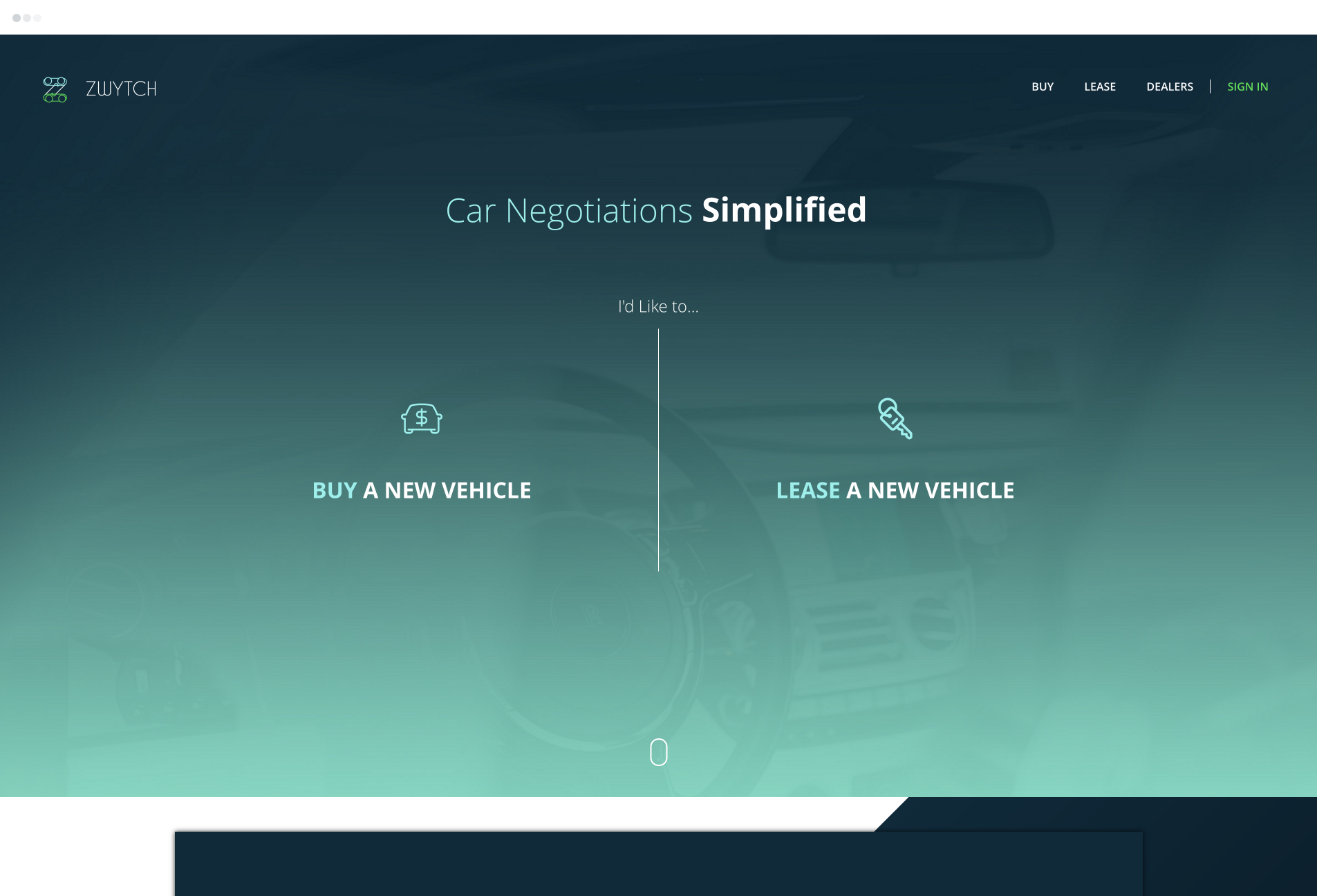
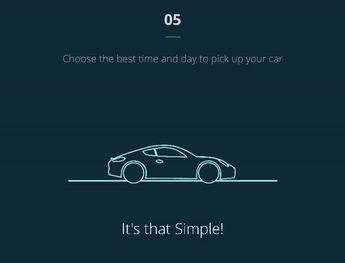
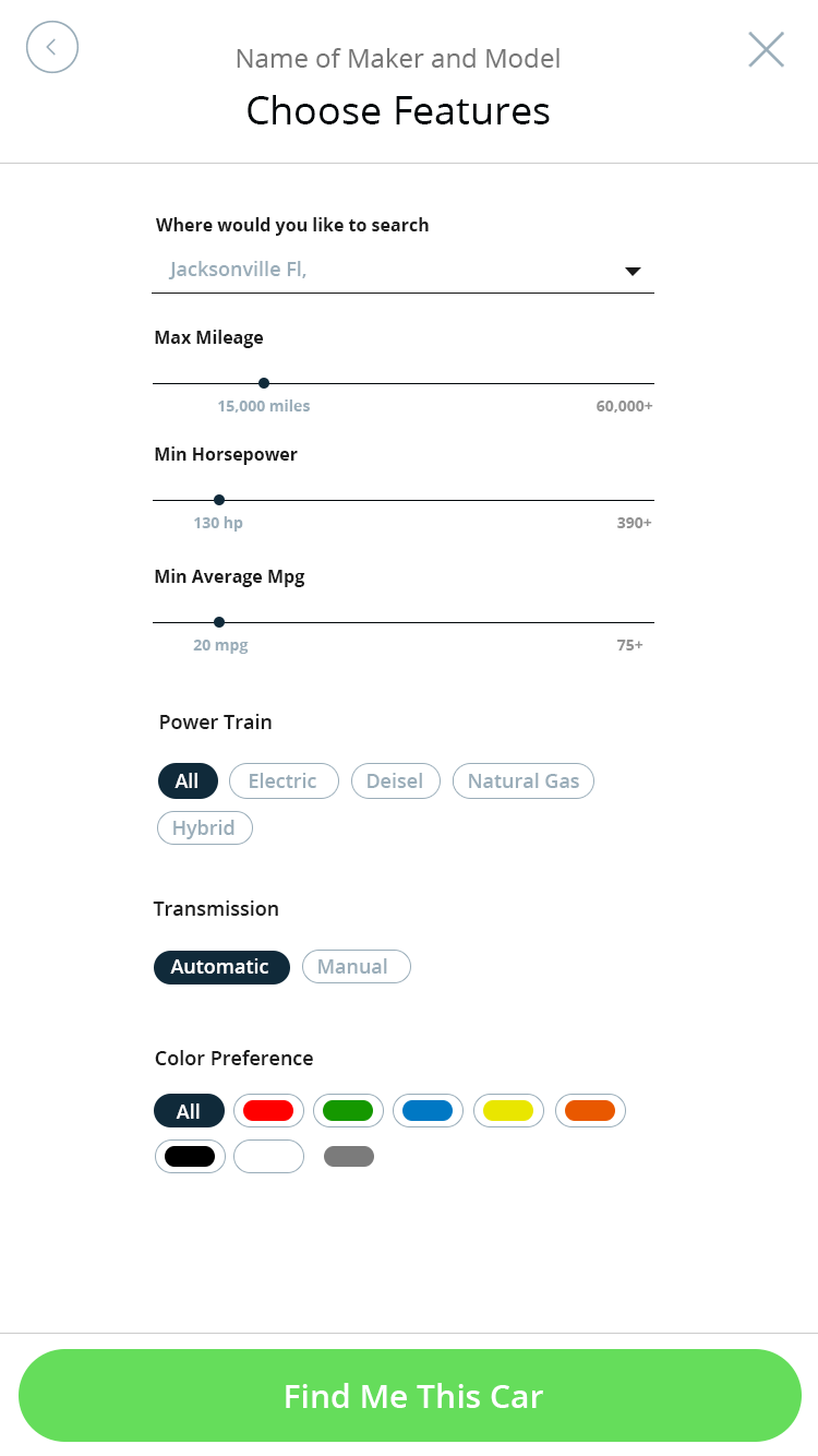
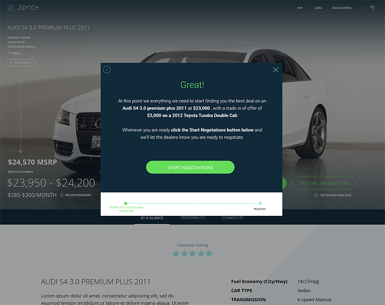
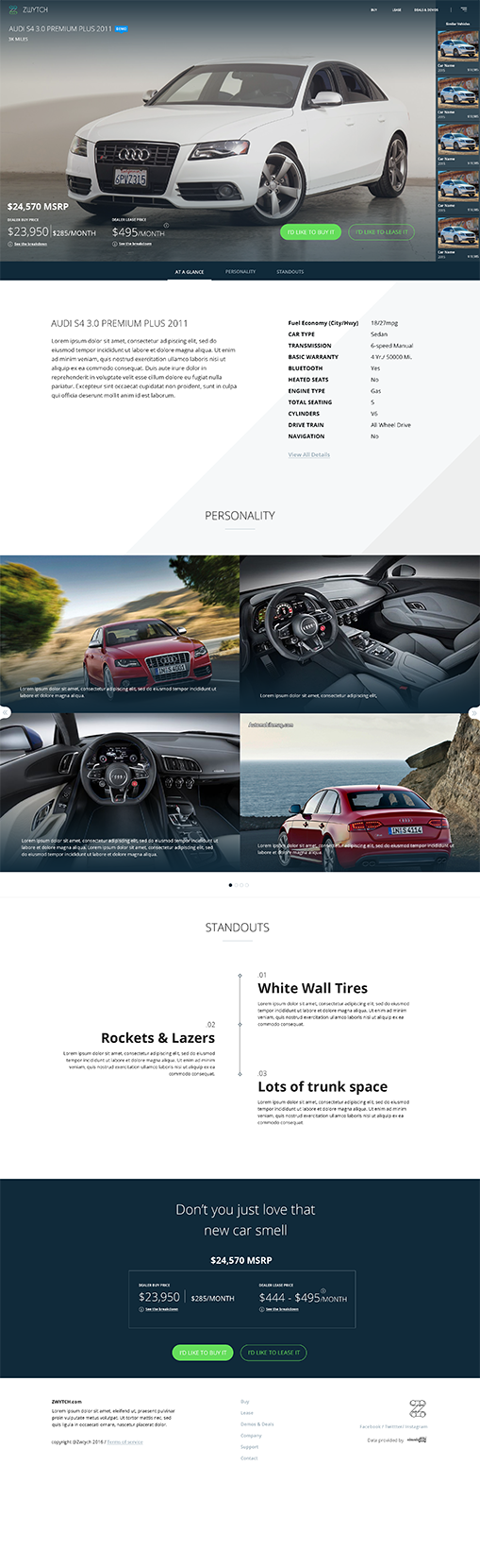
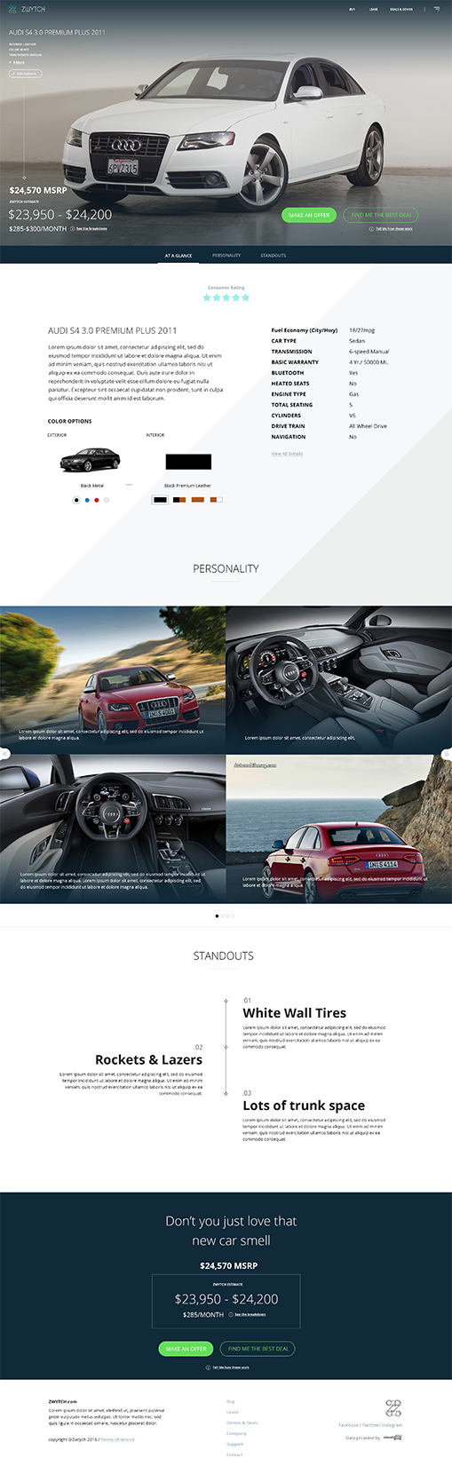
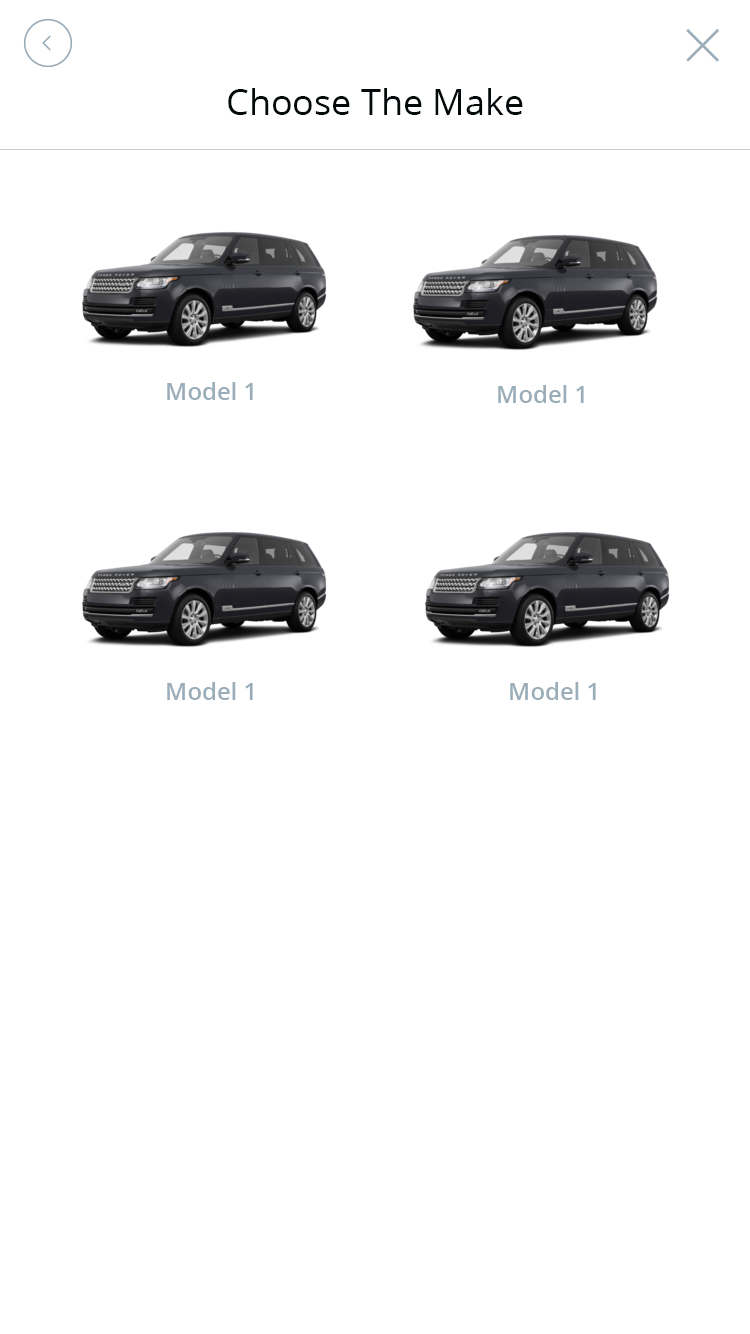
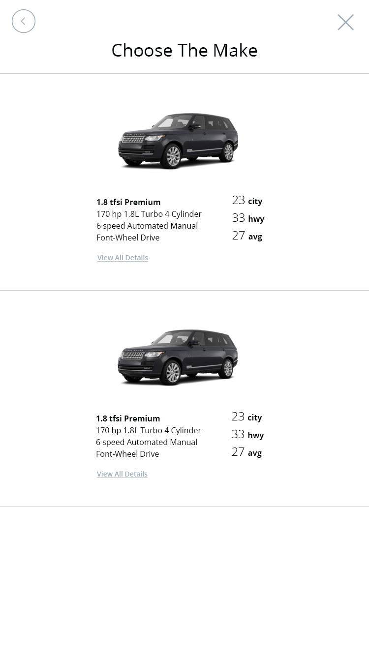
The task of moving car negotations from the dealership floor to a digital medium was no simple challenge. The first objective was to create a clean search experience allowing the user to find the vehicle or types of vehicles they were interested in. Searching is nothing new, but finding a way to encourage users to fill in more details that aren't necessary part of their search experience but part of the negotiation experience was the real challenge. Dealers, prefer to know up front if an offer contains money down or a trade in. It helps them find users the best offers they have available. Users often don't like sharing this information upfront because they feel it could be used against them in the negotiations. Finding the best way to seamlessly capture the users vehicle requests and offer details before they even contact a dealership was our first UX sprint. We used multiple prototypes and tested multiple user flows to find the optimal process.
Solving the negotation process
Give me your best offer
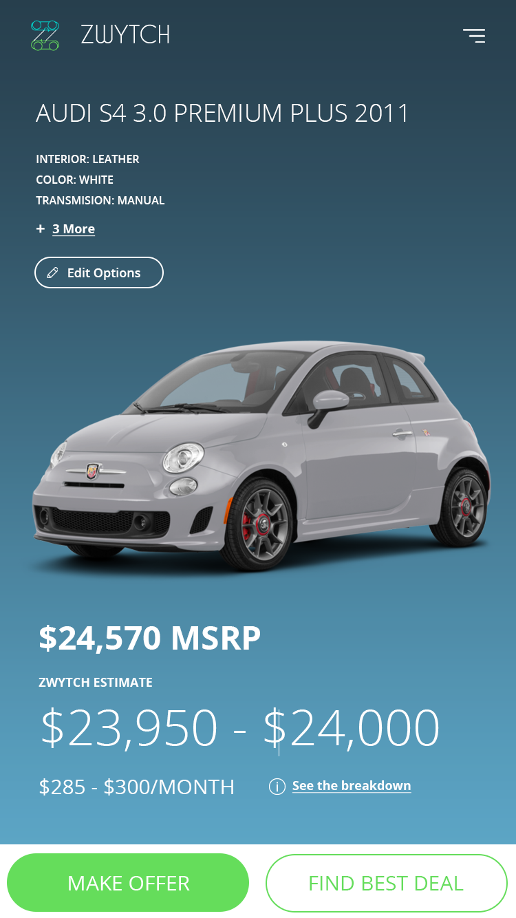
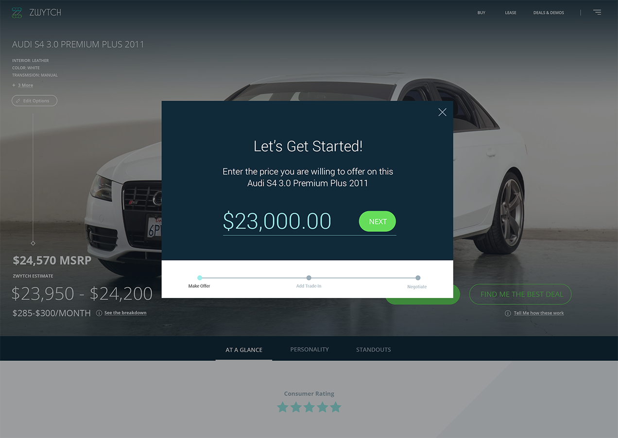
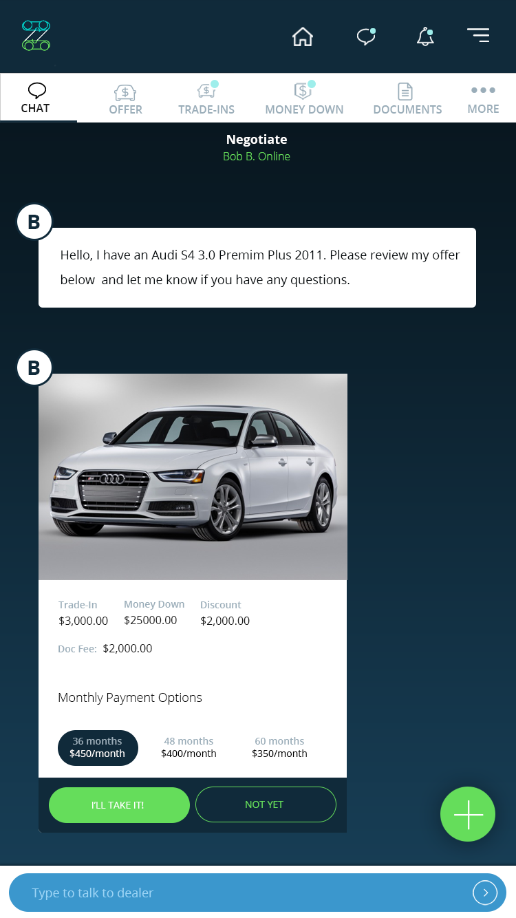
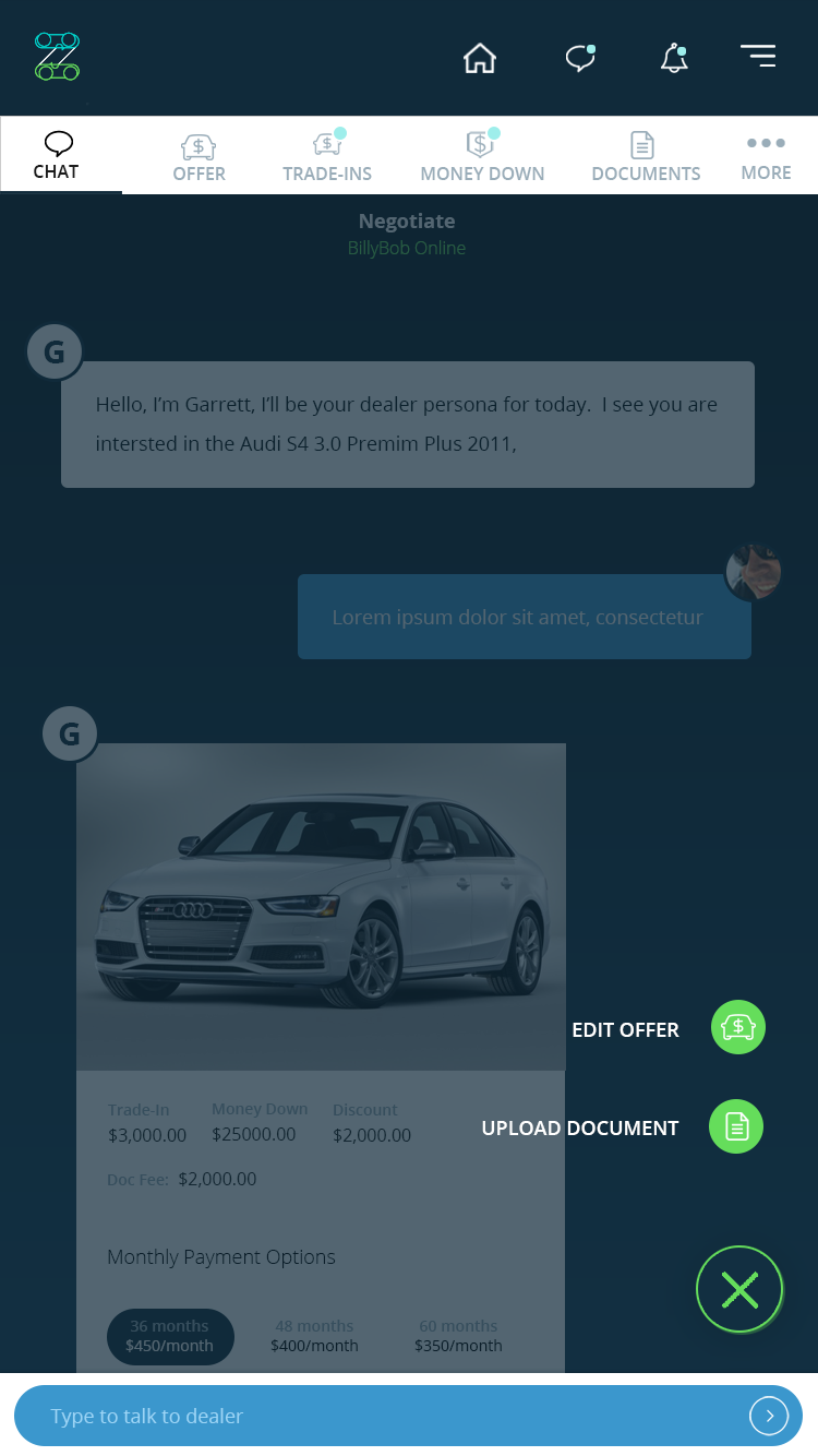
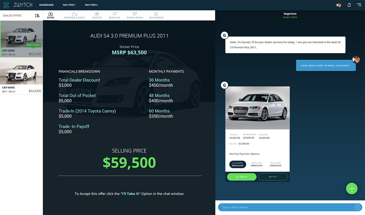
The interesting thing about face to face negotations is the two sides rarely share all the details upfront. An offer is made and it is either accepted or rejected. A rejection has two outcomes. Either the rejectee offers a counter offer or they simply walk away and wait for a better offer. When using a digital medium to facilite negotiations all details have to be laid out on the table or neither side will commit their time. We found this through our iterative design process. Once we understood the flow and what data needed to be presented, it was a matter of finding the optimal way to lay out the details on the screen. We used a modified version of atomic design to prioritize the data and actions into a heirarchy. The heirarchy dictated what data was presented to the user, and what actions were accessible to the user at any given time. The outcome was a very sleek HUD experience on a desktop, with all data presented to both the dealer and the buyer, and allowing the communication platform to always be present so both parties could see conversation history. On mobile, the user could toggle between the offer details and the conversation piece with one tap. In the end, despite all the moving parts, we still managed to deliver a simple clean negotation experience.
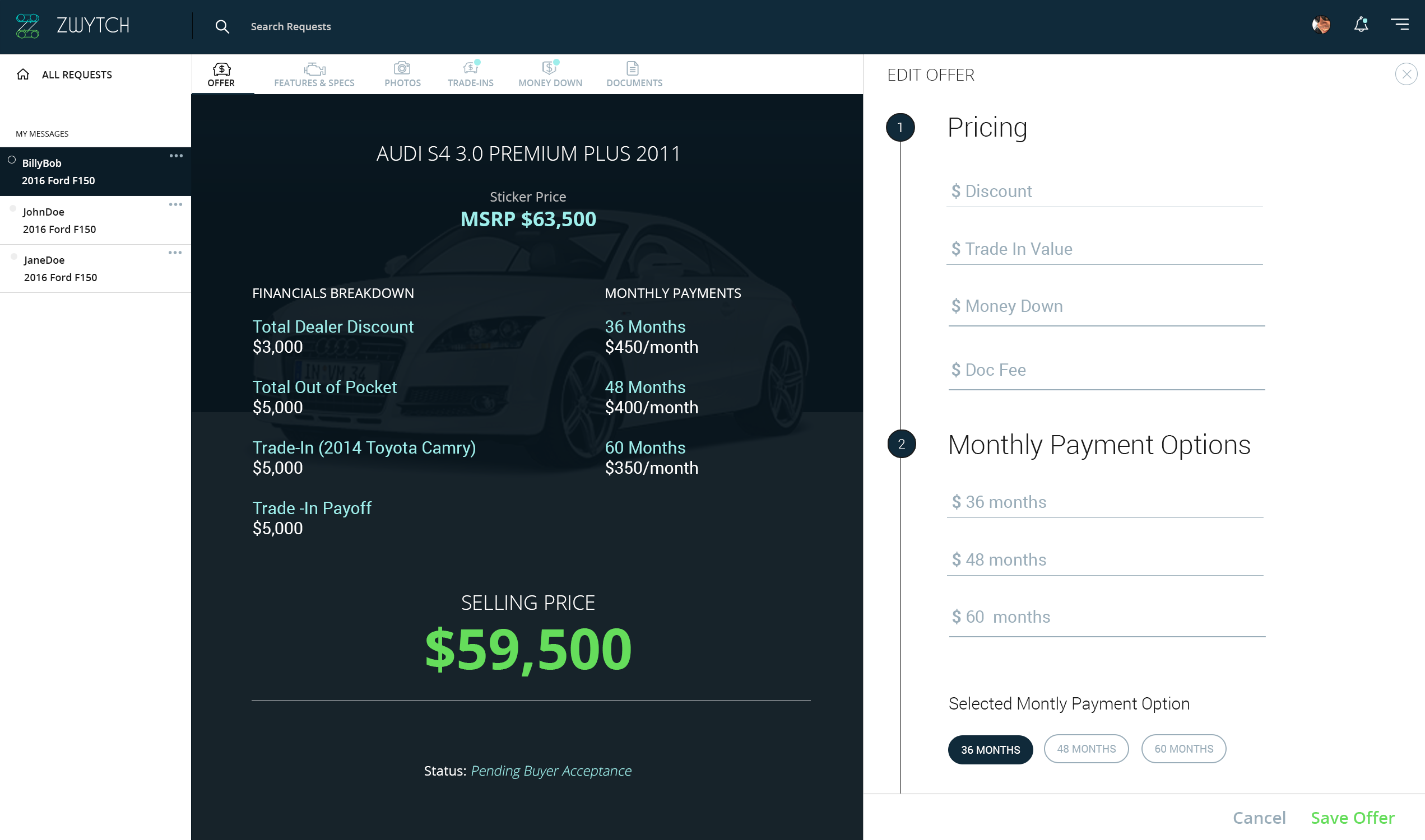
Make me an offer
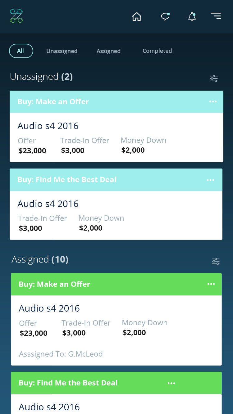
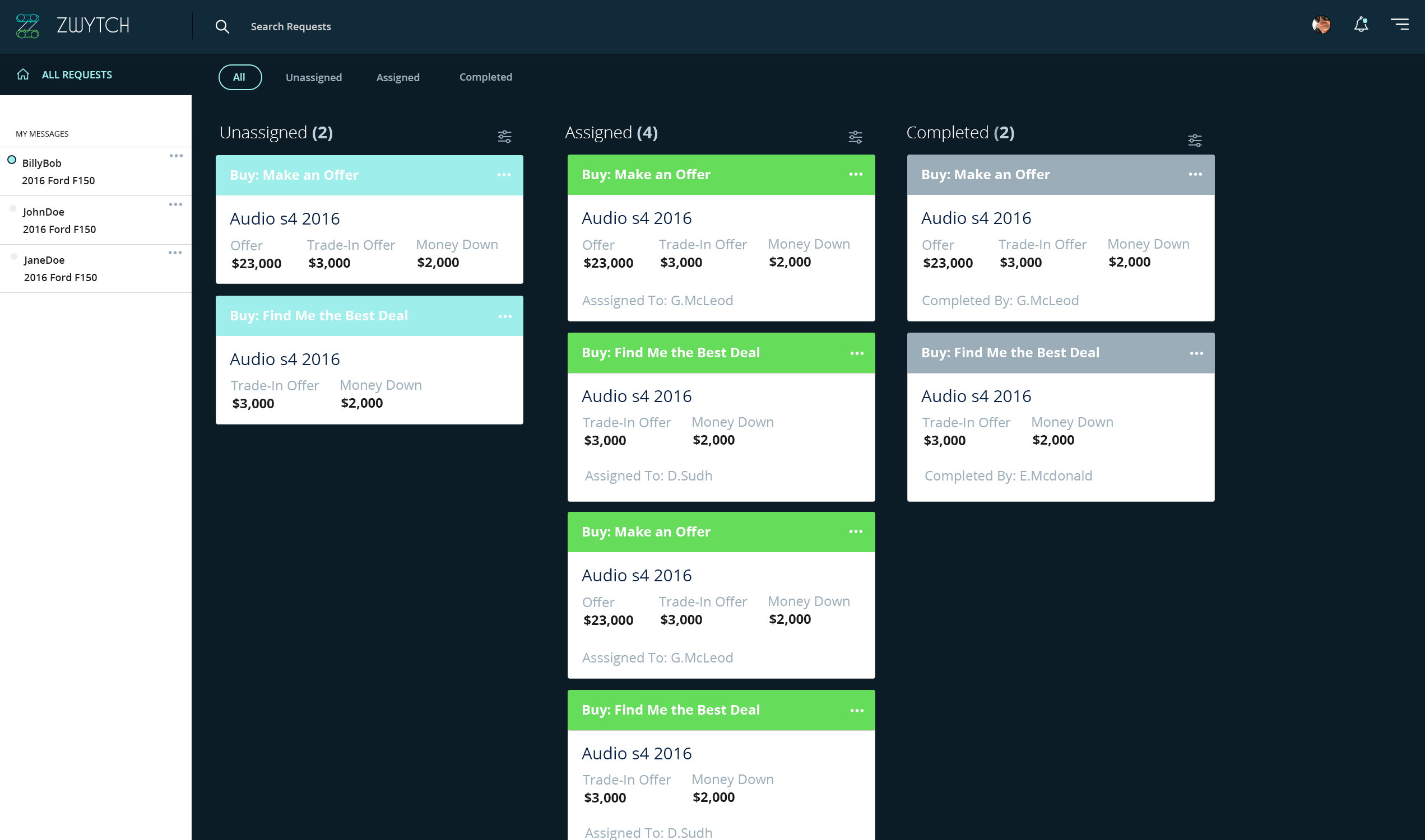
A simple dashboard for managing offer requests
For dealerships it was important that as requests came in, dealers were able to respond promptly and manage the requests workflow. Managing tasks in swim lanes is a common UX pattern that has been proven before. We took what we felt was the simplest approach and validated our assumptions before delivering a scalable, clean, and effective workflow management system.
The Deliverables
Human-Centered iterative designed solutions

33
Mobile Wireframes
54
Web Wireframes
40
Icons
6
User Flow Diagrams
3
Clickable Prototypes
8
Design Sprints
Services
Scope of Work
Branding Strategy
Logo Design
Visual Identity and Assets
Marketing Materials
Brand Guidelines
Content Strategy
UI/UX
Persona Definitions
Wireframes
Website Design
Prototyping
User Flow Diagrams
Web & Mobile UI Design Assets
User Testing
Up Next..
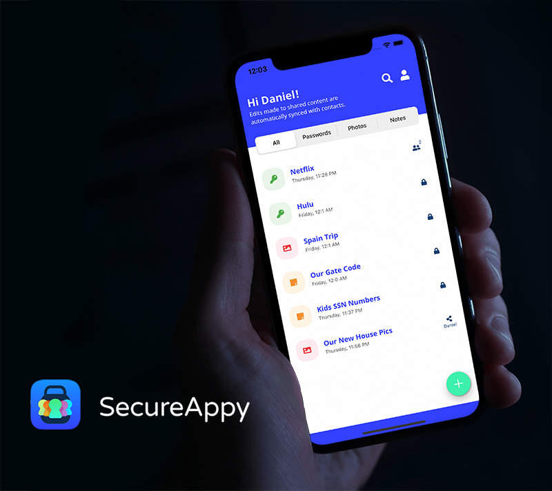
A brand and UI design for the best app on the market for securely storing and sharing private information
SecureaAppy