


A Global Digital Agency....
Netrocon Digital is an amazing company. Since 2002 they've been a leading global IT consulting agency. Their primary focus has been providing contingent IT workers to some of the world's most recognizable organizations. In 2016, the company made a major decision to extend their services to offer digital marketing and design services making them a fully rounded digital agency. With their already global footprint, they are emerging as a world class digital design agency. When the team at Netrocon decided to extend their services, they felt it was a good time for a rebrand. They partnered with Hammock Creative to design the new brand identity and to help them design and build a new engaging website.
The Brand Identity
Logo, Color, Typography and Messaging...
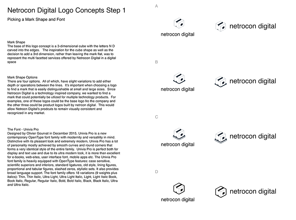
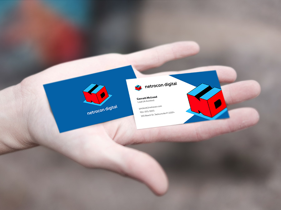
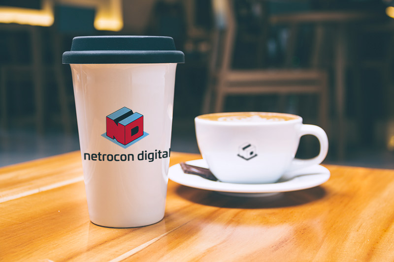
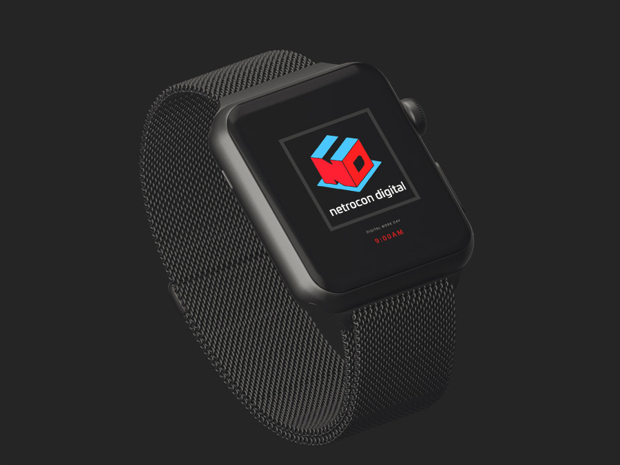
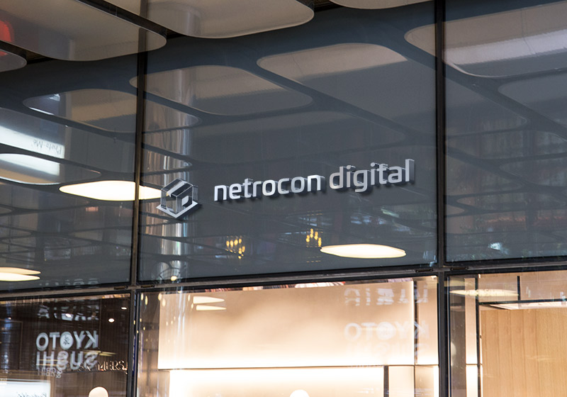
The original logo for Netrocon was designed in 2002. The concept of digital design back in the early 2000s was much different than today. This lead to a style that has been labeled as Web 2.0. The original Netrocon logo had that same feel. The colors were muted. The shape was abstract and the font was futuristic and sharp. When we went to the drawing board for the rebrand, we started with the logo shape. With the new addition of the word "digital" to the name, we wanted the logo mark to represent both words. However, both words are fairly long, which made using a ligature challenging. Because of this, we decided to explore something that was simple and easy to recognize, familiar but different. We settled on a cube shape. Though not a revolutionary idea, it was recognizable. It gave a nod to their IT consulting past, while embracing the new, by carving the letters into the edges. We tried multiple variations of this approach, and landed on a shape that we felt was simple but different enough that it stood on its own.
4
Logo Concepts
5
Color Schemes
1
Week to Deliver
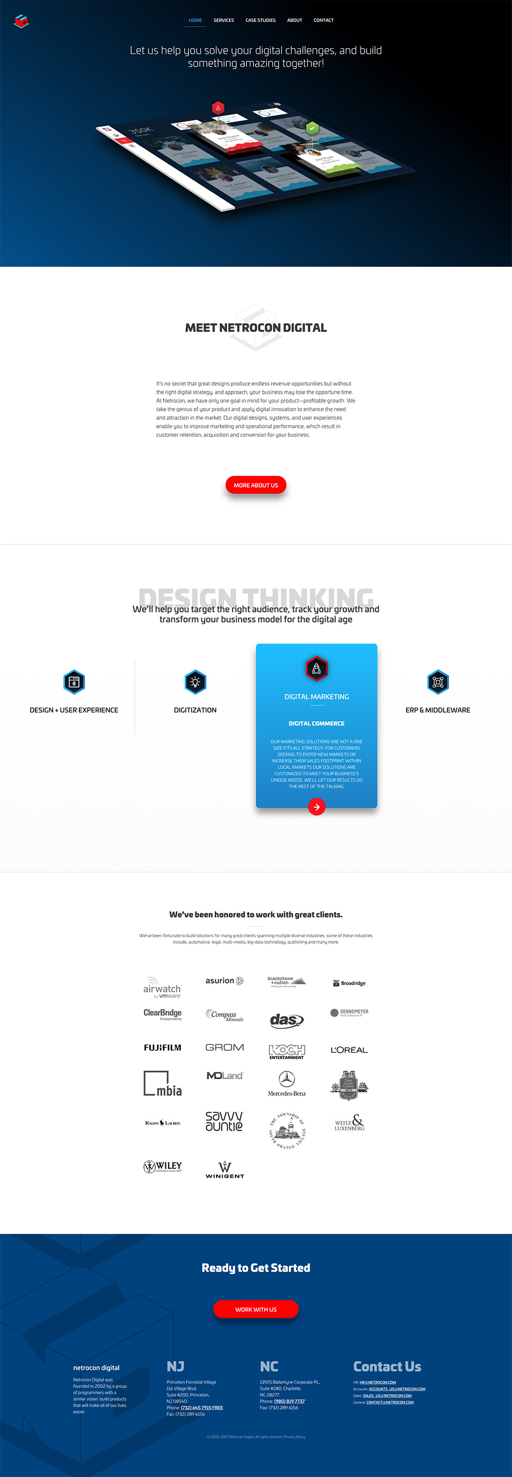
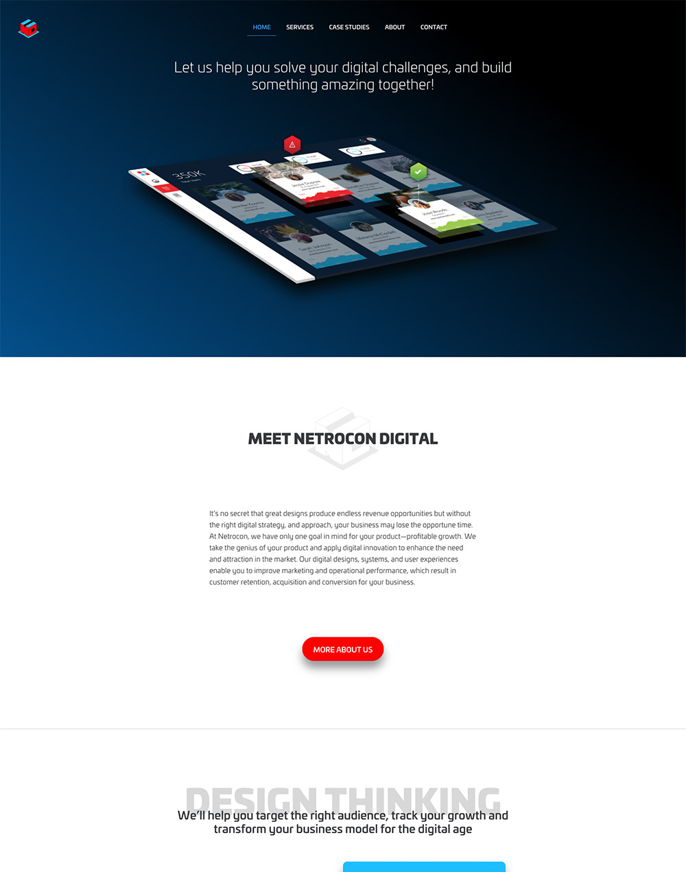
The Website
UI Design, Fast Development
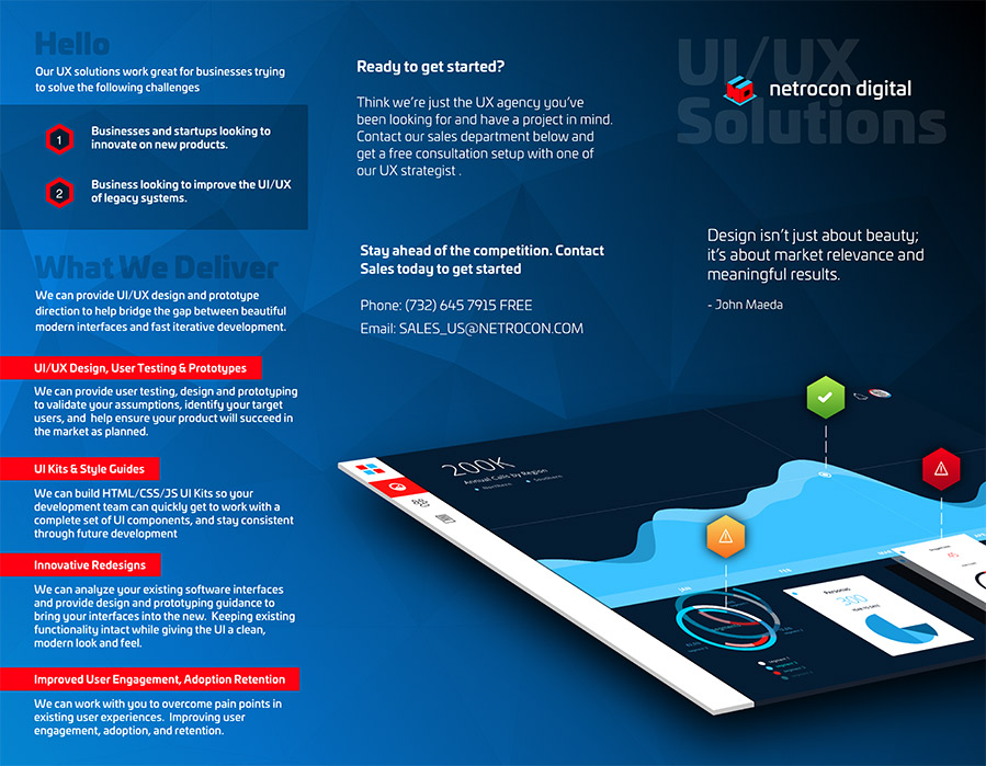
For the website we worked at light speed. We had exactly two weeks to find a design and style, get it approved, and launch. It was a rapid pace, but the final product is bold, engaging, and optimized for fast loading times.
13
Wireframes
10
Pages
2
Weeks to launch


Services
Scope of Work
Branding Strategy
Logo Design
Visual Identity and Assets
Marketing Materials
Brand Guidelines
Content Strategy
UI/UX
Wireframes
Website Design
Website Development
Prototyping
Up Next..
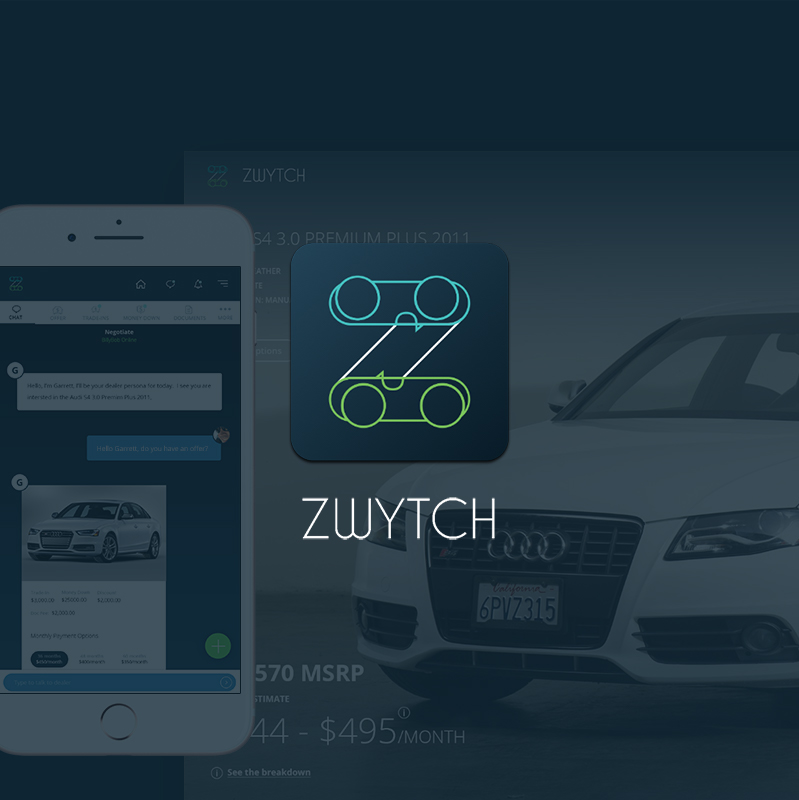
Pronounced /switch/ is a platform that allows car buyers to negotiate the purchase of a vehicle without ever having to go in to the dealership.
ZWYTCH Auto